View Designer
The View designer opens after you select the View Design (from Template), View Design (from Scratch), or Example Chart Design in Add New Item.
It allows you to create Web pages from the entity/model and the page templates:
Home (Home.sdv): This page is automatically generated and can be used as the home page of the application.
Layout (Layout.sdv): This page is automatically generated and is used to design the layout of the application, such as page hierarchy and navigation. Each project can only have one Layout.sdv file.
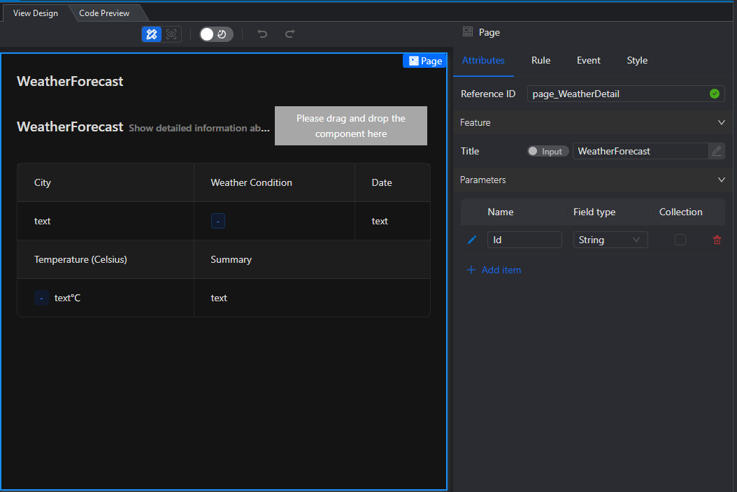
Detail page: This page template is used to display a piece of data. You can quickly create one or more pages based on this template (right-click the project node and select Add > New Item. In the Designer-developed tab, select View Design (from Template), click Next, select a model or entity, and then select Detail page.)
Form page: This page template is used to add or modify one or more pieces of data. You can quickly create one or more pages based on this template (the method is the same as above, select Form page in the last step).
Table page: This page template is used to display multiple pieces of data. You can quickly create one or more pages based on this template (the method is the same as above, select Table page in the last step).
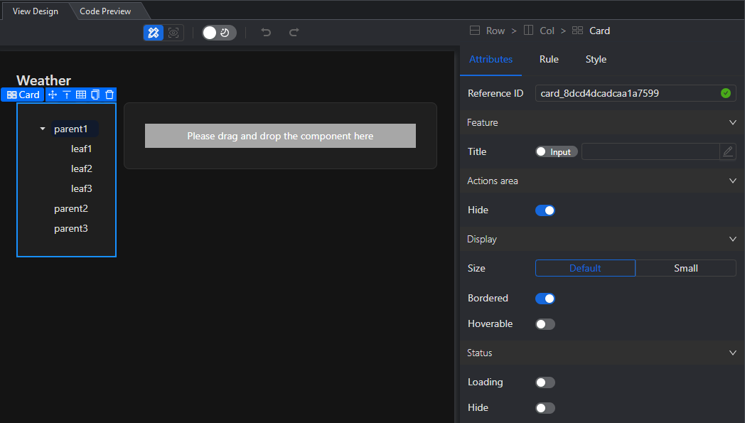
TreeTable page: This page template displays multiple tables in a tree structure in the left-right layout. The left side is a tree, each node corresponds to a table, and the right side displays the data of that table. You can quickly create one or more pages based on this template (the method is the same as above, select TreeTable page in the last step).
Example Chart page: This page template displays data in a chart. You can quickly create one or more chart views based on this template (right-click the project node and select Add > New Item. In the Designer-developed tab, select Example Chart Design.)
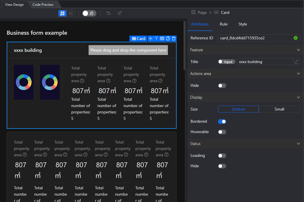
Different view pages and templates provide different configuration options. You can open each page, view the hierarchy and select components through the Outline Tree, or directly select the component in the middle UI Designer, and then view and set related settings in the Attributes, Rule, Event, and Style pages on the right.
Home page (Home.sdv)
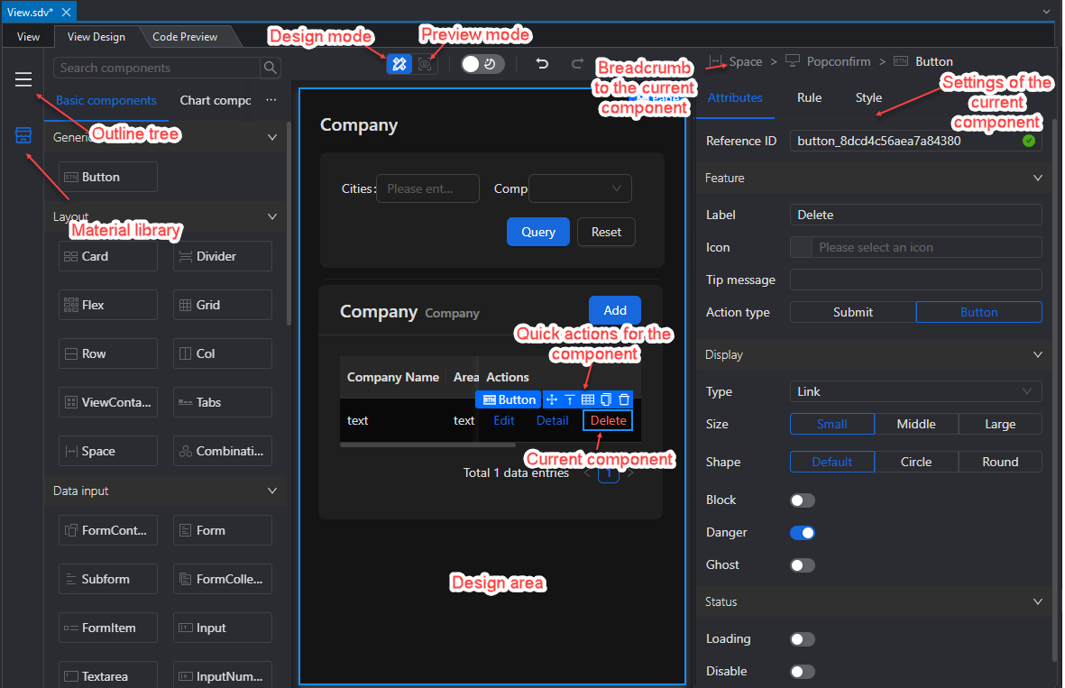
The Home.sdv home page file is automatically generated when the Vue Web designer project is generated.
In the Material Library on the left, you can select the desired component and drag it to the UI Designer in the middle, and then configure it in the Attributes, Rule, Event, and Style pages on the right.
In the Outline Tree on the left, you can view the hierarchical relationship between page components and select the component to be configured, or you can directly select the component you want to configure in the UI Designer in the middle and configure it on the right.
After modifying the configuration, you can instantly view the latest effect of the page in the middle. Or click Preview Mode to view the page in the browser.
Layout page (Layout.sdv)
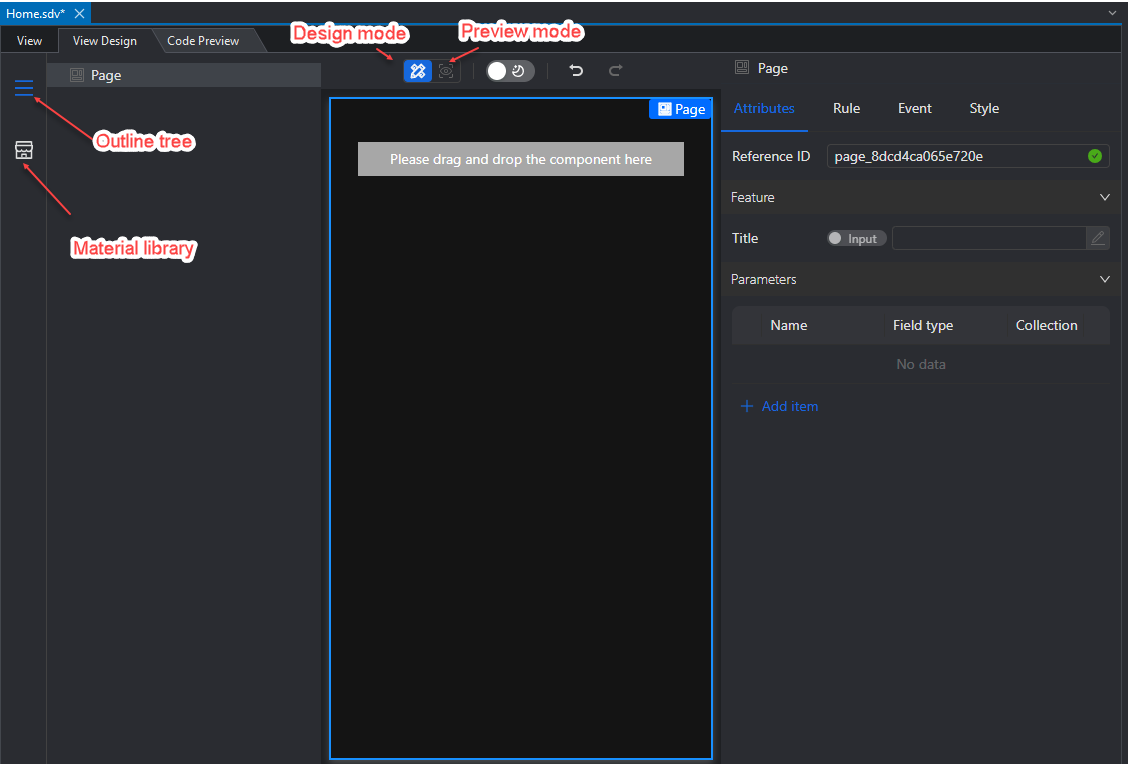
The Layout.sdv layout page file is automatically generated when the Vue Web designer project is generated.
In the Outline Tree on the left, you can view the hierarchical relationship between page components and select the components to be configured. You can also directly select the components you want to configure in the UI Designer in the middle, and then configure them in the Attributes, Rule, Event, and Style pages on the right.
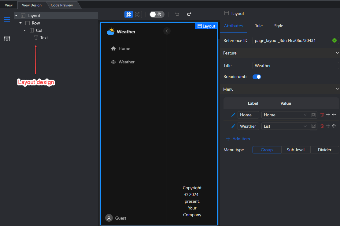
The current layout page only supports menu layouts and menu items, and does not support adding other layouts or components. Menu items (and submenu items) are added, deleted, and modified in the Attributes page on the right.
After modifying the configuration, you can instantly view the latest effect of the page in the middle. Or click Preview mode to preview the page in the browser.
Form page
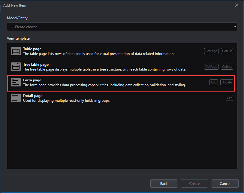
To quickly create a page from the Form page template, right-click the project node and select Add > New Item. In the Designer-developed tab, select View Design (from Template), click Next, select a model or entity, and then select Form page. This template is available for selection when the selected model or entity has an Add and/or Update API.
You can select the desired component in the Material library on the left and drag it to the UI Designer in the middle, and then configure it in the Attributes, Rule, Event, and Style pages on the right.
You can also view the hierarchical relationship between page components and select the component to be configured in the Outline tree on the left, or directly select the component you want to configure in the UI Designer in the middle and configure it on the right.
As shown in the figure below, you can click the Temperature (Celsius) number input box in the UI Designer in the middle and configure the input box on the right. You can configure the general configuration of the input box in the Attributes page, such as: Data binding, Default value, value range, appearance, status, etc., and you can also configure simple validation rules in the Rule page, such as: whether it is required, validation expression, length range, value range, etc.
After modifying the configuration, you can view the latest effect of the page in the middle. Or click Preview mode to preview the page in the browser.
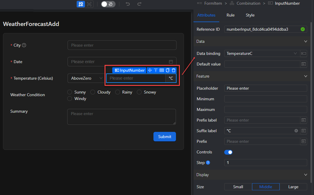
Table page
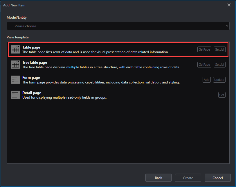
To quickly create a page from the Table page template, right-click the project node and select Add > New Item. In the Designer-developed tab, select View Design (from Template), click Next, select a model or entity, and then select Table page. This template is selectable when the selected model or entity has a GetList and/or GetPage API.
You can select the desired component in the Material library on the left and drag it to the UI Designer in the middle, and then configure it in the Attributes, Rule, Event, and Style pages on the right.
You can also view the hierarchical relationship between page components and select the component to be configured in the Outline tree on the left, or directly select the component you want to configure in the UI Designer in the middle and configure it on the right.
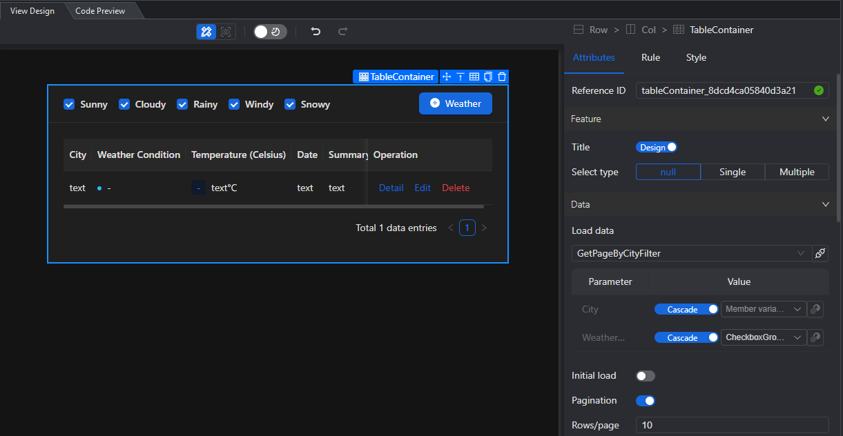
As shown in the figure below, you can click the Table container component in the Outline tree, and then configure the general configuration of the component in the Attributes page, such as: request and parameters for loading data, query fields, form layout, data columns, etc., in the Event page, configure the operation type, and in the Style page, set the margin.
After modifying the configuration, you can instantly view the latest effect of the page in the middle. Or click Preview mode to preview the page in the browser.
TreeTable page
To quickly create a page from the TreeTable page template, you can right-click the project node and select Add > New Item. In the Designer-developed tab, select View Design (from Template), click Next, select a model or entity, and then select TreeTable page. This template is selectable when the selected model or entity has a GetList and/or GetPage API.
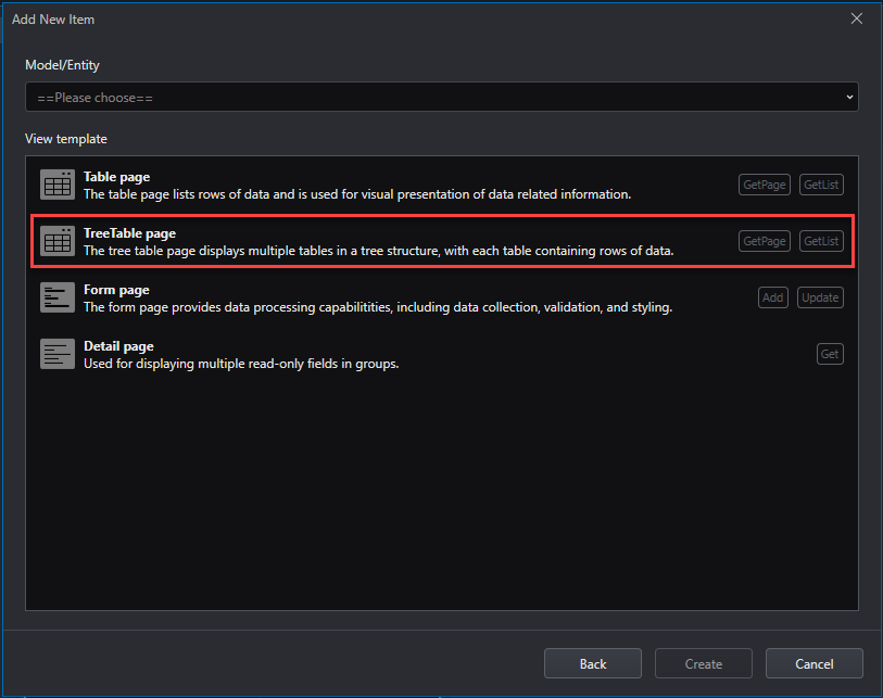
You can select the desired component in the Material library on the left and drag it to the UI Design in the middle, and then configure it in the Attributes, Rule, Event, and Style pages on the right.
You can also view the hierarchical relationship between page components and select the components to be configured in the Outline tree on the left, or directly select the components you want to configure in the UI Designer in the middle and configure them on the right.
After modifying the configuration, you can instantly view the latest effect of the page in the middle. Or click Preview mode to preview the page in the browser.
Details page
To quickly create a page from the Details page template, right-click the project node and select Add > New Item. In the Designer-developed tab, select View Design (from Template), click Next, select a model or entity, and then select Details page. This template is selectable when there is a Get API in the selected model or entity.
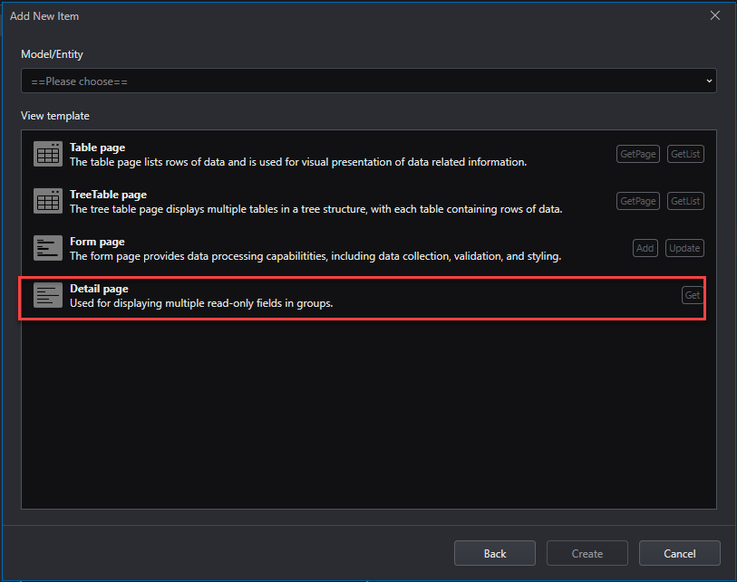
You can select the desired component in the Material library on the left and drag it to the UI Designer in the middle, and then configure it in the Attributes, Rule, Event, and Style pages on the right.
You can also view the hierarchical relationship between page components and select the component to be configured in the Outline tree on the left, or directly select the component to be configured in the UI Designer in the middle and configure it on the right.
As shown in the figure below, you can click Details in the Outline tree, and then configure the general configuration of the page in the Attributes page, such as page parameters, simple validation rules in the Rule page, page load requests in the Event page, and margins in the Style page.
After modifying the configuration, you can view the latest page effect in the middle immediately. Or click Preview mode to preview the page in the browser.
Example Chart page
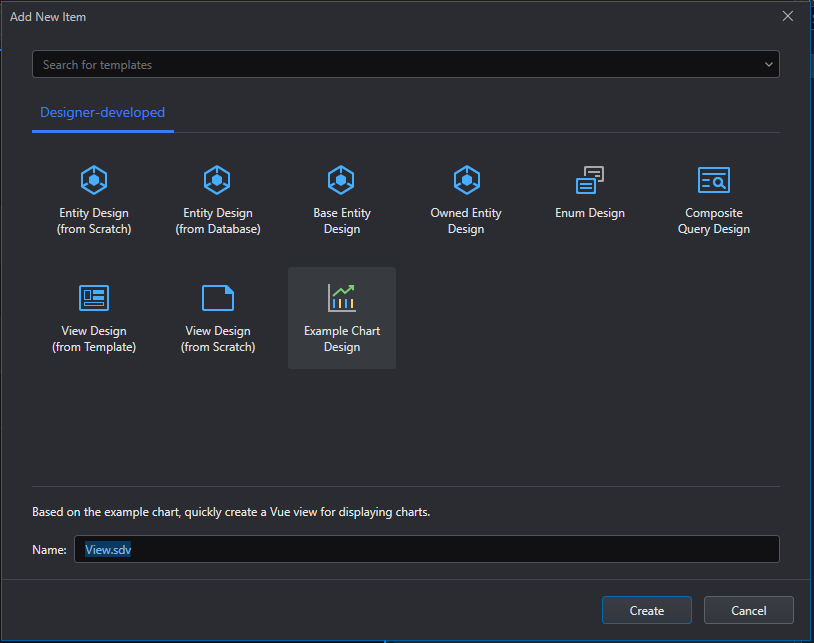
To quickly create a page from the example chart page template, right-click the project node and select Add > New Item. In the Designer-developed tab, select Example Chart Design and click Create.
You can select the desired component from the Basic Components or Chart Components tab in the Material library on the left and drag it to the UI Designer in the middle, and then configure it in the Attributes, Rule, Event, and Style pages on the right.
You can also view the hierarchical relationship between page components and select the component to be configured in the Outline tree on the left, or directly select the component you want to configure in the UI Designer in the middle and configure it on the right.
After modifying the configuration, you can immediately view the latest effect of the page in the middle. Or click Preview mode to preview the page in the browser.
